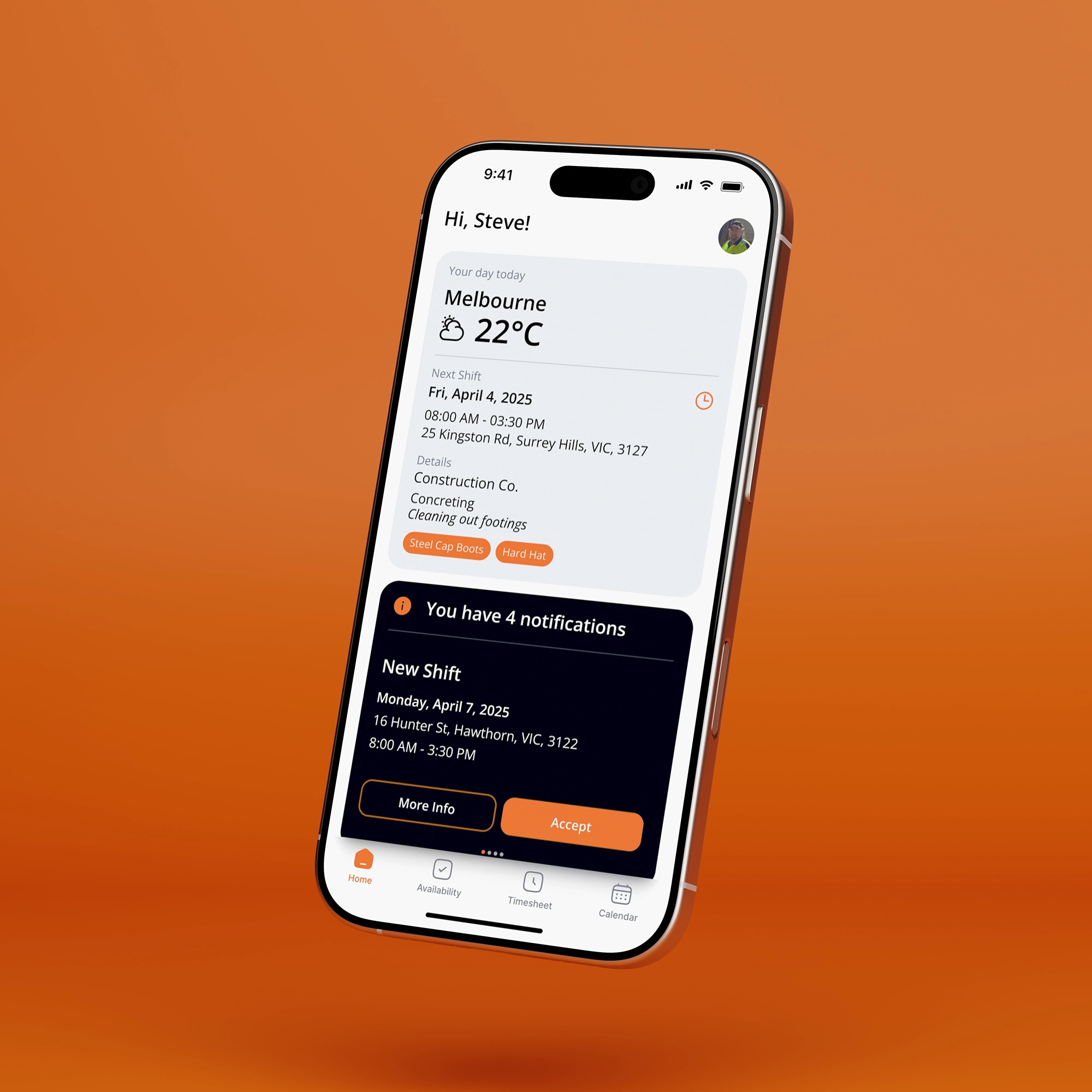
The homepage includes a compact, swipeable notification card that allows staff and clients to view and address notifications while remaining anchored to the homepage. In this instance, a Labourly staff member is notified of a new shift and directed to a page with additional shift details. After accepting or declining, the staff member is returned to the homepage and shown a confirmation of their action.
The client side of the app allows users to request labour for their worksites. The UX challenge was enabling them to request several tradespeople within a single form. To solve this, I split the form into two sections: one for general information relevant to all tradespeople, and another for details specific to each individual. This approach prevents users from repeating information and streamlines the overall submission process.
Labourly staff provide their rolling two-week availability through a simple opt-in process. Users can tap a date once to mark themselves as available, and a second time to mark themselves as unavailable. After submitting, they're presented with a confirmation that their input was successfully recorded.
The app supports staff timesheet submissions and, in this case, client timesheet approvals. To streamline the workflow, clients can approve multiple timesheets for a single worksite at once. They can also provide feedback on individual tradespeople, helping to inform future shift assignments.
I designed the app iteratively to ensure it met the client’s needs and expectations. Like the rest of the app, the shift request feature began with rough sketches and was purposefully refined over time. While it started in a more basic form, the core idea of separating general and specific details was already in place. Later in the process, the client and I decided to restructure the form into a multi-step flow. This was a deliberate choice that prioritised a more enjoyable user experience over pure efficiency.
The entire app was prototyped and animated in Figma to demonstrate how the final product would function. This also helped the developer understand the intended interactions, supported by features like auto layout, component libraries, and well-defined grids with consistent spacing to streamline development and reduce build time.


